Hi there, I’m Shyronn Smardon—visual distiller & craft proponent.
I believe in loving what you do, challenging yourself and drinking a tall glass of water before starting your day.
I believe in loving what you do, challenging yourself and drinking a tall glass of water before starting your day.
The ten projects below took much focused work—as well the assistance of exceptional instructors. I hope that you'll find my craft and dedication to the design field fit for this generous financial opportunity.
Thank you.
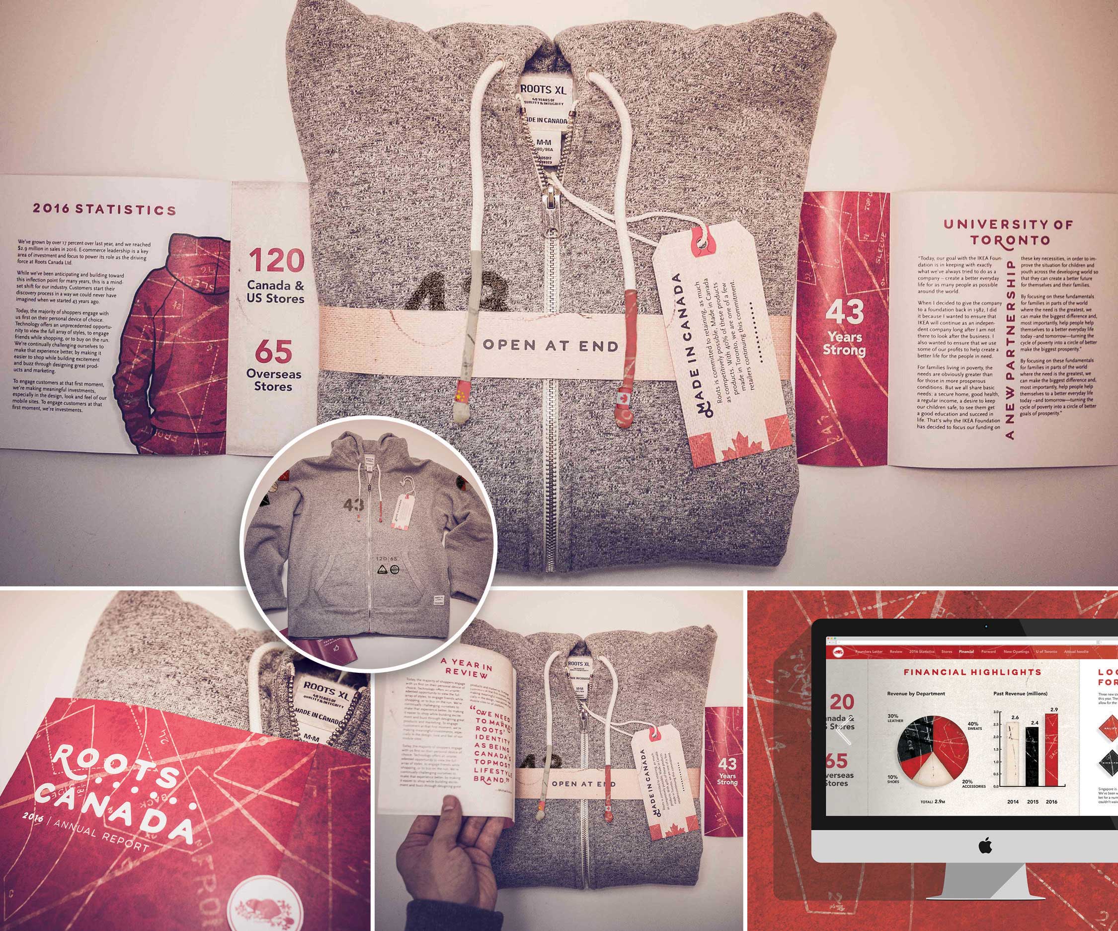
Engaging my audience was my primary focus; how to get the Roots district managers re-excited about an annual rudimentary metrics event was my personal challenge. At the heart of the company exists raw materials and resources readily available, so I centered the report on just that: the Roots Made in Canada hoodie.
Inspired by the initial stages of clothing design—sewing and pattern making—I layered a graphic base with patterns and texture, and then branded it with Canada’s iconic colour, red.
The report is a type of gift back to the district directors—something each can keep and reuse. The applied graphics are major details from the report that allows the directors to easily refer to past company achievements, as well as future goals. The paper report easily folds up, and can be stored or recycled, as necessary.
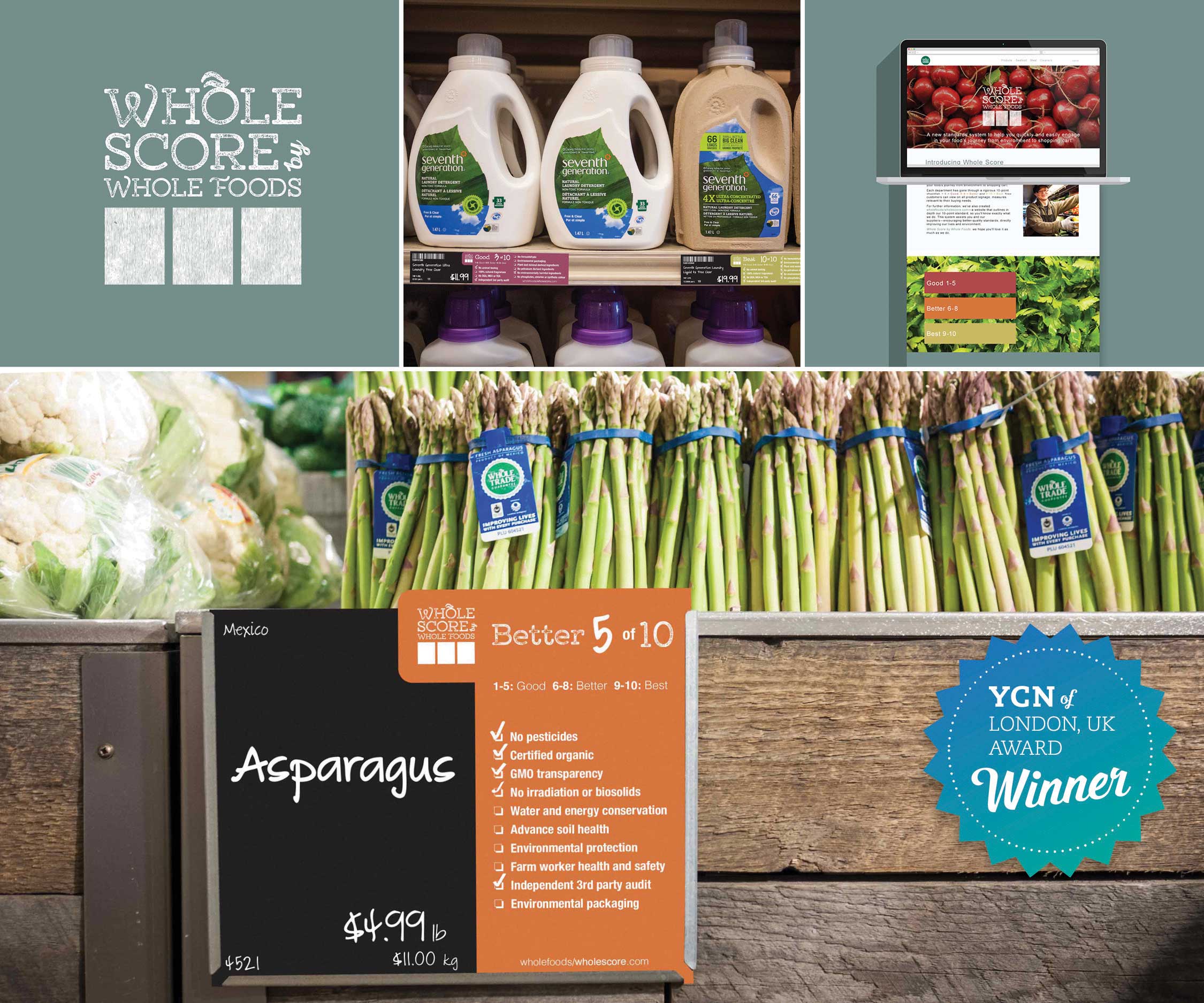
The target: to create a new, and cohesive, visual rating system for Whole Foods Market. The aim is to model a clear and more digestible way of presenting information to both customers and store staff in the fast-paced environment.
Previously, there were separate rating systems for different departments within Whole Foods. The style, standards and visual language varied between these departments, causing confusion for customers and requiring them to rely heavily on supplemental information.
I've identified it would be most beneficial to see a ratings score alongside each product, enabling customers to make smart/quick decisions about items. Because we naturally think in tens and label space is limited, I chose ten as the optimal checklist for all departments. Several of the labels remain the same size, while others slightly enlarged—but offer much more reader information.
To further simplify the system, three visual colour codes were used to quickly assist customers and staff to know which products have Good (1-5), Better (6-8) or Best (9-10) rating. In addition, a microsite was created to launch and explain the new Whole Score system.
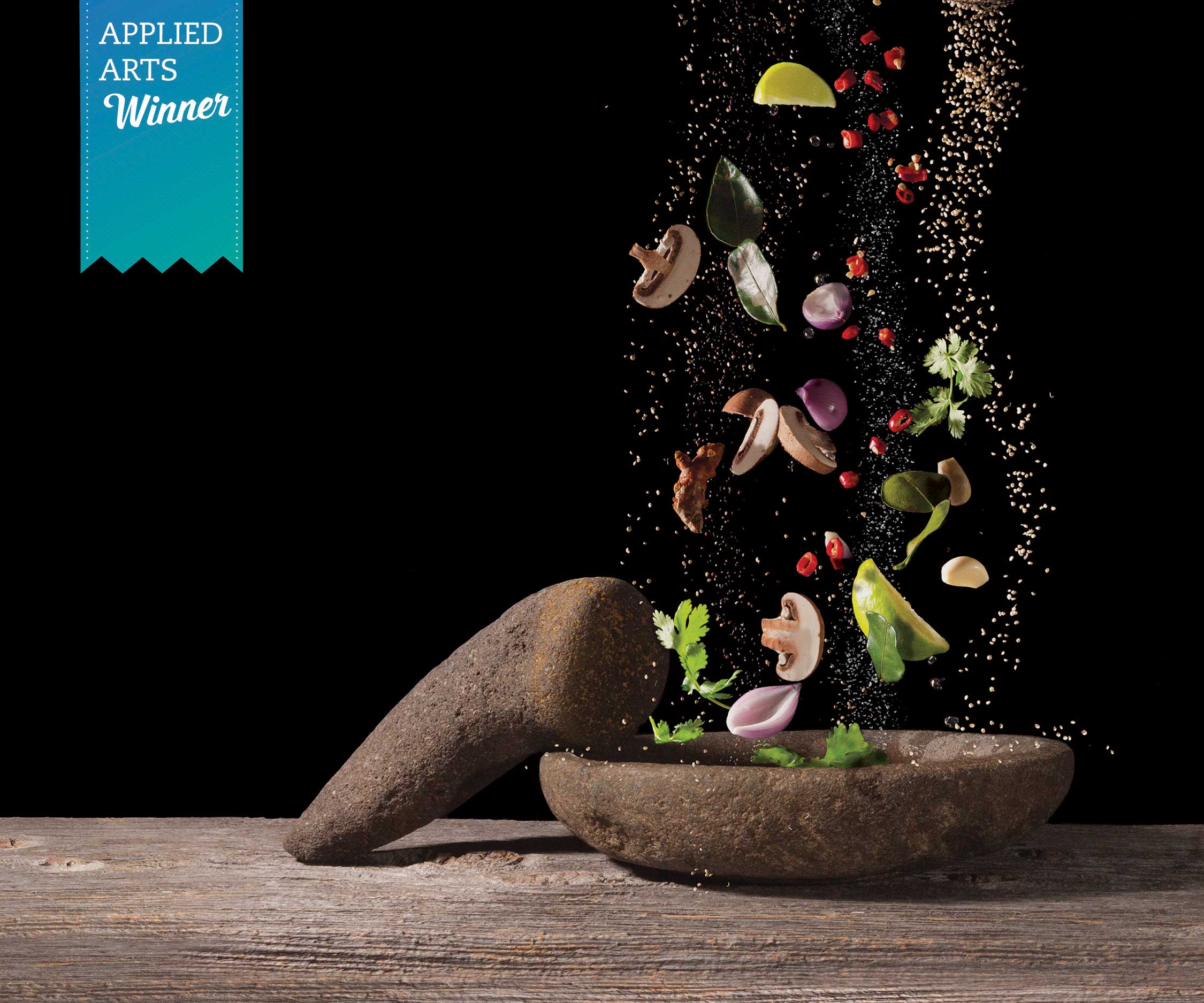
Seasoned [see-zuh nd]: heightened, improved or enhanced flavour of food—and design students. Handcrafted as artwork for the well-flavoured IDEA Program cookbook. This photo was awarded with a 2015 Applied Arts Award for photography single.
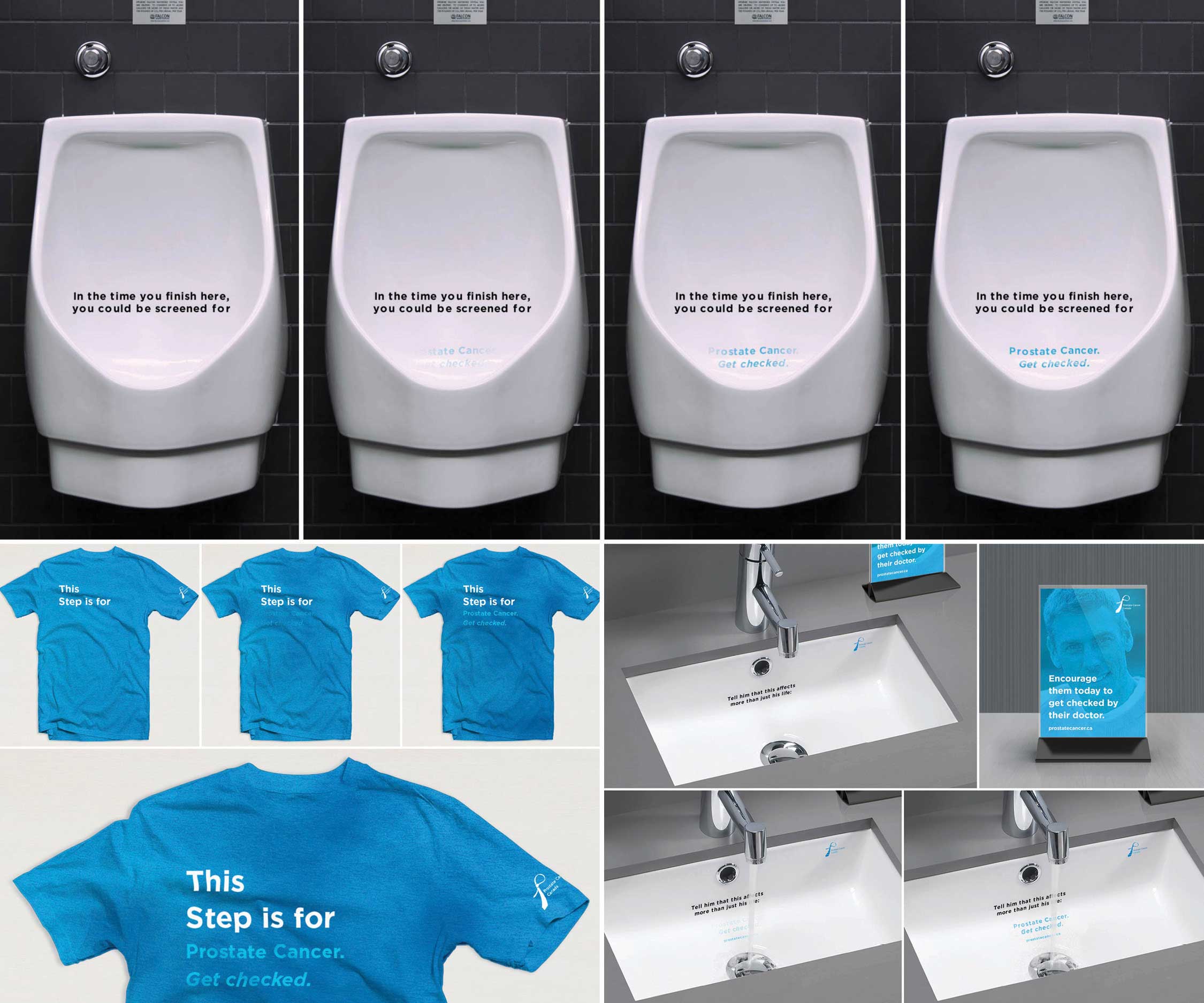
Prostate Cancer Canada raises funds for the development of many prostate cancer research programs in Canada.
Many men are reluctant to visit a doctor’s office for regular check-ups. This number increases in men over the age of 40—the recommended age to begin annual prostate cancer screening. In order to increase patient screening, Get Checked is a campaign aimed not only at these target males but also to the individuals who are most important to them: loved ones.
In this campaign, there are various partial messages displayed in public washrooms, and through the use of thermochromic inks (inks that are activated by heat), the remaining part of the message is revealed to the reader. The call to action is to educate Canadians and increase the number of prostate cancer screenings.
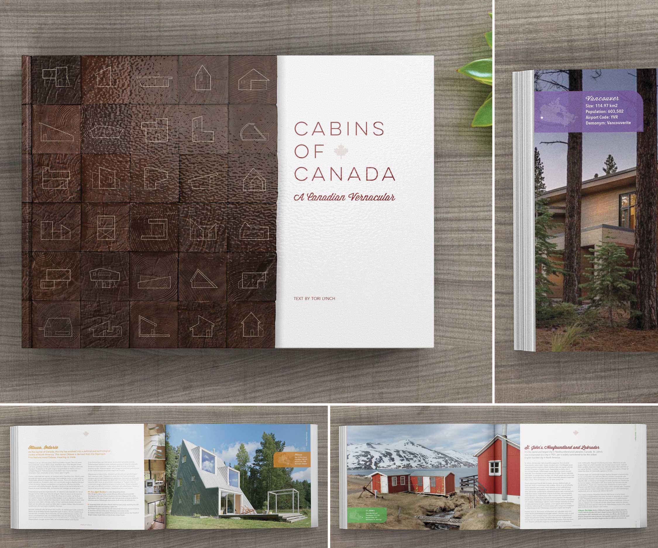
Create a 300-page coffee table book that uniquely captures and unites Canadian Cities was the objective. I arrived at cabins as the subject, as these homes away from home are characteristically a reflection of our own personality and are just as varied as the Canadian landscape and experience. Because cabins are places of retreat and typically out of sight from the general public, I recognized this concept would capture and engage a wide audience.
I wanted to challenge the definition of a cabin, so I focused on regional cabins that showcased a diverse visual vernacular and ones that would retain the reader’s attention for brief and lengthier intervals of time. Largely, the type esthetic is modern peppered with a hint of whimsical personality. The overarching ambition of Cabins of Canada was to personally gain a better understanding of grids, pacing and type hierarchy.
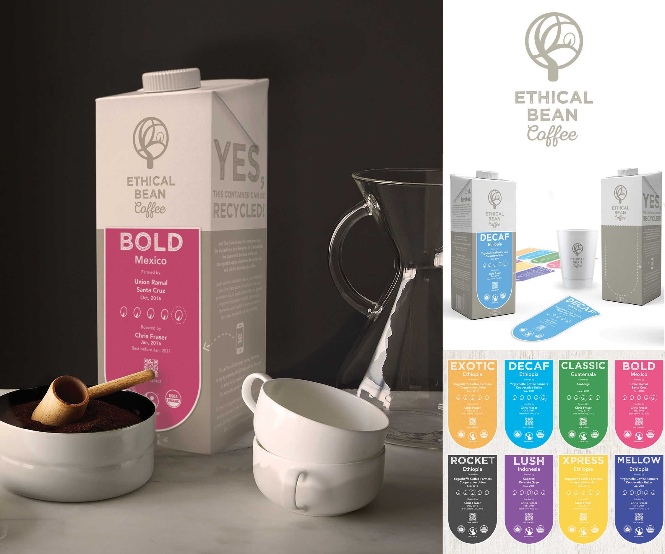
Increasingly, consumers are conscious of how their food is produced and what comes in contact with it. Ethical Bean has been at the forefront of this ideology and lifestyle since its inception. The design requirement was to update and rebrand Ethical Bean so that the company aligns their brand more with their target audience. My first response was to reflect and infuse the company’s ethical ideals into their packaging—as their previous plastic and foil bags were not recyclable.
Instead of creating expensive custom packaging, I sought out packaging that was used locally and highly recyclable. The one I found most purposeful for this product: sealable juice cartons. Although beans may not stay as airtight after opening as their previous plastic and foil counterparts, I've identified that the ethical target audience would willingly make the small sacrifice in order to be completely ethical and cost appropriate.
As the company sells several varieties of coffee that all require different graphics, I chose to considerably cut costs and environmental impact by using only one colour and one carton for all assortments. This combined with unique front labels will produce the variety of graphics required. Additionally, by designing labels that are easily modified, instances such as farmed by and roasted by can easily be updated as product information changes.
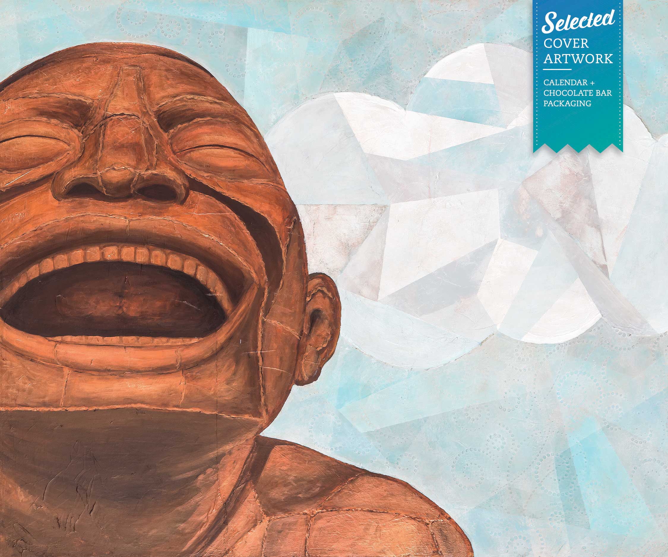
As a Halifax native with an affinity to Canada’s beautiful coastline, Yue Minjun’s expressive A-maz-ing Laughter sculptures at English Bay have become my favourite destination spot after relocating to Vancouver. They are a reminder to myself to never take life too seriously, and to always create room for laughter.
English Bay was selected as the cover art for Vancouver’s Reflections 2016 calendar as well as the artwork for Blossom Spice & Chocolates’ 2016 special edition West End chocolate bar.
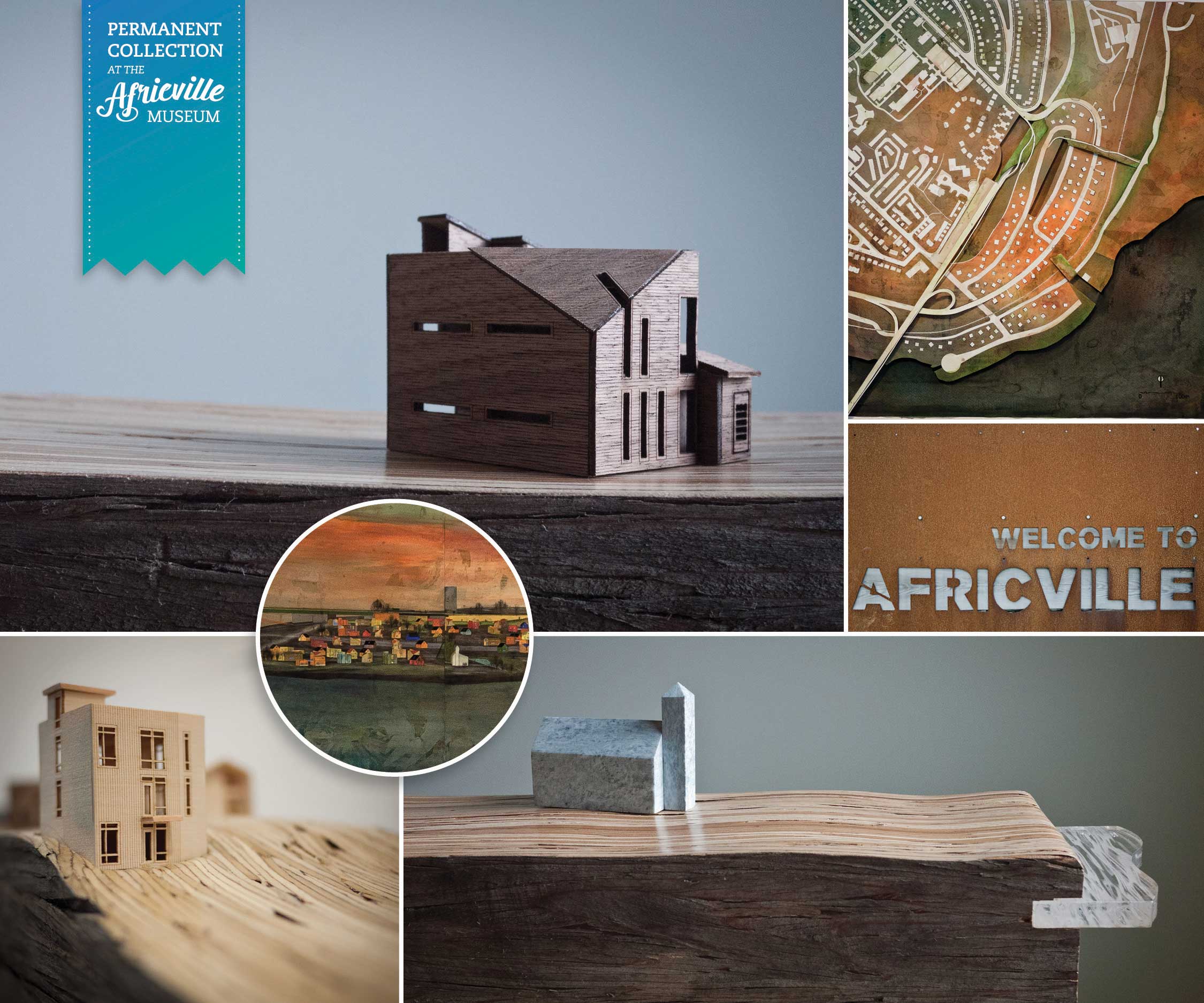
This thesis examines the 1960s relocation of over eighty families from the former community of Africville, in the North End of Halifax, Nova Scotia, Canada into nearby public housing. It investigates the narrative of what was, is and could perhaps one day be.
Rebuilding Africville challenges the idea of re-stitching community and character back into the former site of Africville. The intent of this dissertation is to design multi-owned housing for the site, as well as a central civic structure that acts as the community anchor. It does not attempt to replicate what once existed over forty years ago; it does, however, attempt to extract elements that were once highlights of Africville and graft them with modern ideas.
The images are highlights from the larger body of work. This study in its entirety was gifted to the Africville Heritage Trust, and is now part of the permanent collection in the Africville Museum in Halifax, NS
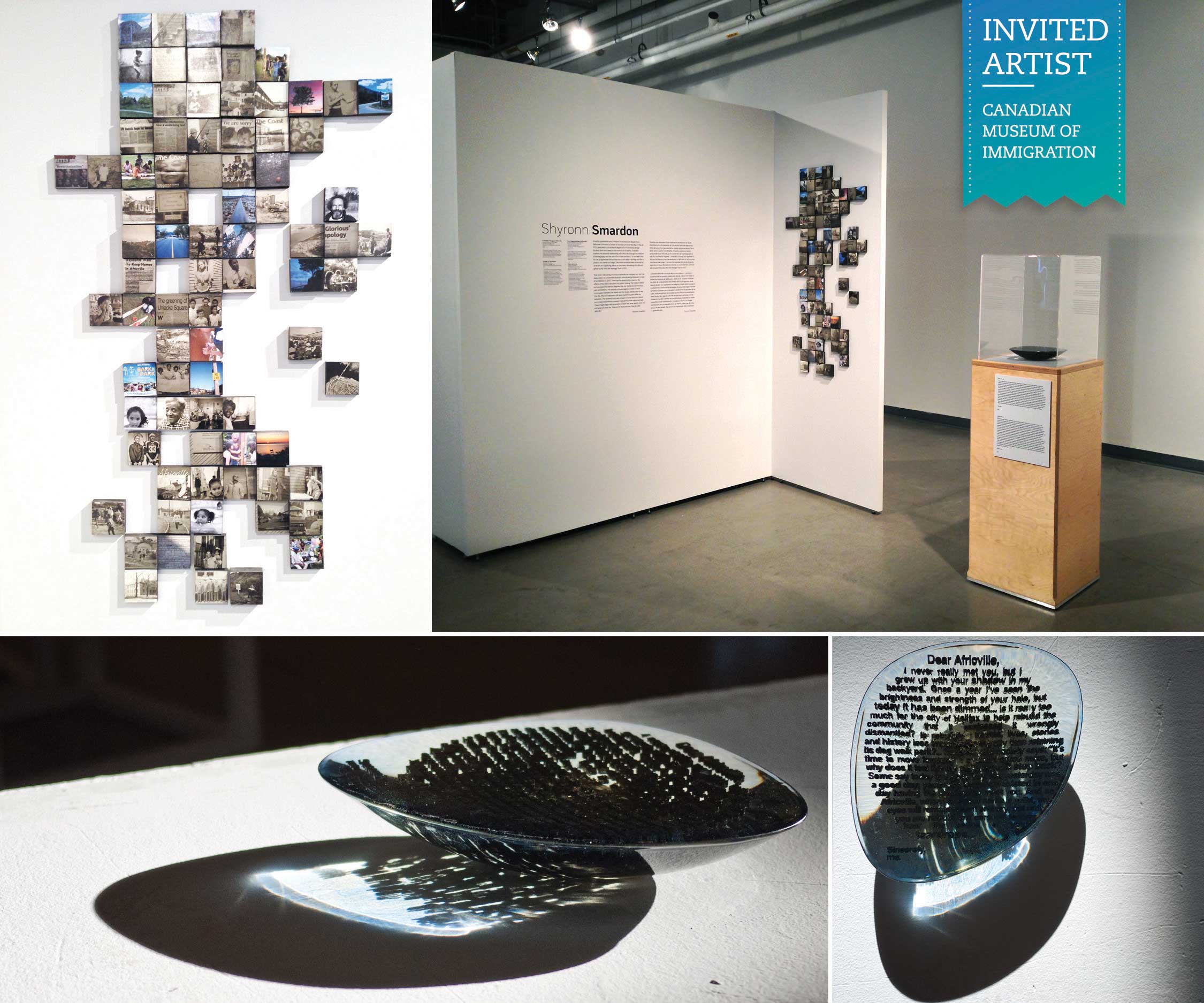
Originally exhibited at the Royal Ontario Museum in 2010-2011, Position As Desired was designed with the intention to insert African Canadian visual arts into mainstream Canadian consciousness. In 2013, the exhibit traveled to the Canadian Museum of Immigration at Pier 21. Two thesis pieces—Pixelation and Puddle of Teardrops—were featured with the collection from January 22 to March 30, 2013 in the Ralph and Rose Chiodo Harbourside Gallery.
Pixelation is a storyboard of Africville, created with various images taken over the past 40 years. The voids in the story represent the results of relocation: both premature pixels that have not had the opportunity to fully develop, as well as future pixels that have a promising prospect for change.
Puddle of Teardrops: Using three-dimensional printed text, this piece takes excerpts from a response letter I wrote named Dear Africville. The note was my reply to the city apology and settlement announcement between the community of Africville and the City of Halifax. Puddle of Teardrops became a study of transformation from one-dimensional thought, to two-dimensional text, into three-dimensional form. The studio assignment was to design a container; I responded by constructing a container—however using its inverse as my subject. The void of the container was filled with resin, and once cured, its outer shell was removed. What remains in the final piece is the three-dimensional text from the letter left floating in a puddle of teardrops.
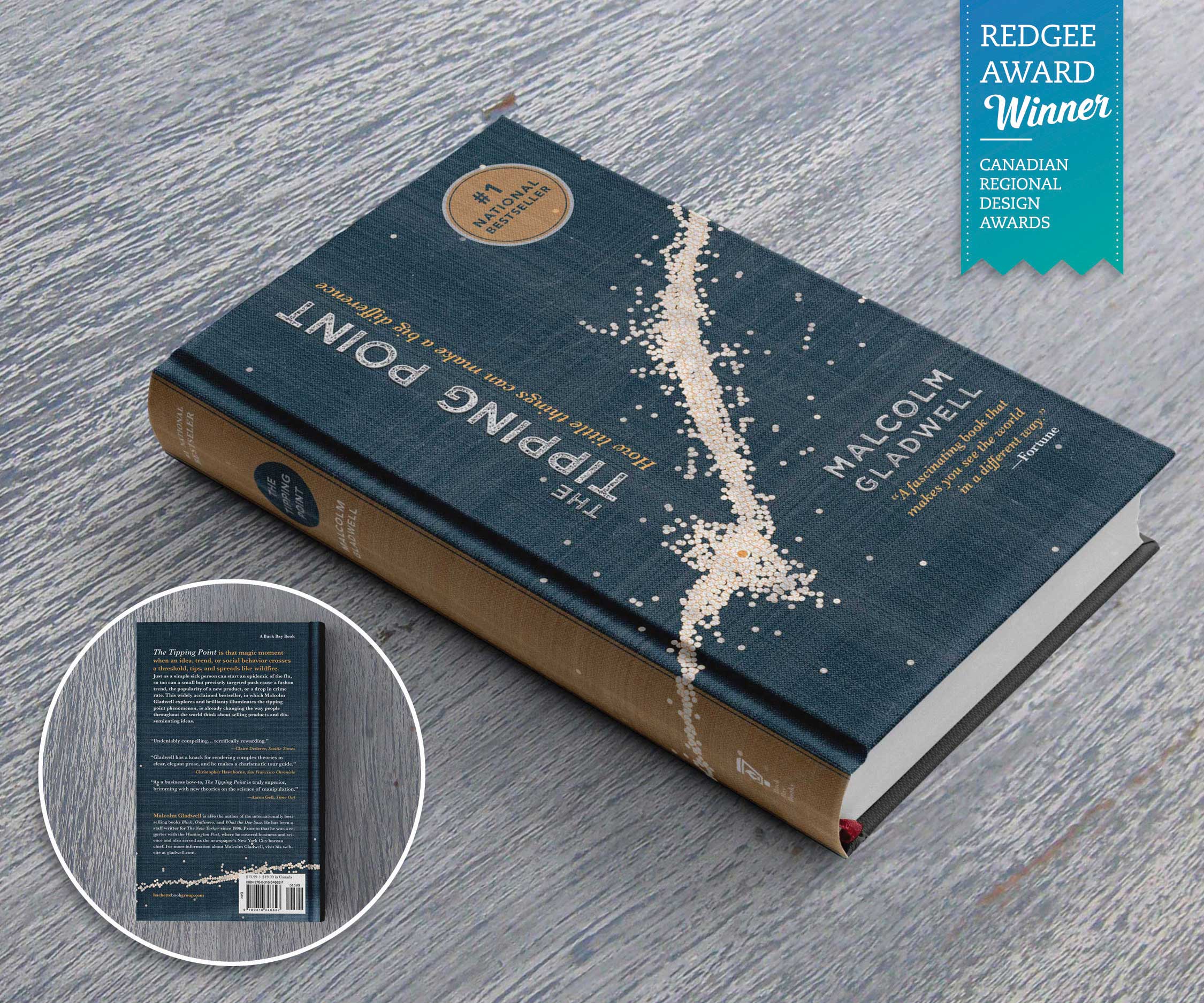
Malcom Gladwell’s Tipping Point is about the subtle nuances of how things go viral. As a result of this, I created a new visual layer for the front cover that hints at this message through an illustrative graph fused over a buckram texture.
The objective is to blur the line between modern and traditional—with the personal challenge to retain all of the existing text of the original book. To extend the concept outside the life of the studio, I imagine this redesign being one of a 3-book boxed set to include, Gladwell’s other bestselling books: Blink and Outliers.